Astrophotography is often framed as a problem of acquisition: better optics, better mounts, better cameras, more integration time. All of those things matter, but they tend to overshadow something just as important — understanding how the system you already have actually behaves over time. This project started as curiosity. I wasn’t chasing a specific problem or trying to optimize a single number. I wanted to know whether my pier-mounted system was behaving the way I thought it was, and whether the assumptions I’d built up through experience were actually supported by data. What followed was a shift from intuition to measurement. Not because intuition is useless, but because it’s incomplete — especially when subtle mechanical behavior accumulates across many sessions.
The Problem With “It Feels Fine”
Most of us develop a sense for how our equipment behaves. We know which knobs feel smooth, which adjustments are frustrating, and which steps in the workflow seem to take longer than they should. Over time, those impressions turn into assumptions. In my case, I was confident that azimuth was the dominant source of polar alignment trouble. The azimuth bolts felt less controlled. Adjustments felt coarse. Ergonomically, it was always the part of alignment I dreaded most.
That belief wasn’t unreasonable — but it also wasn’t tested.
The problem with relying on feel is that mechanical systems don’t care how something feels. They care about friction, preload, load vectors, and repeatability. Subtle behavior that doesn’t register consciously can still dominate performance over time. If you never measure, you never find out where your intuition is wrong.
Why Polar Alignment Is a Good Candidate for Measurement
Polar alignment sits at an interesting intersection in astrophotography. It’s foundational, but it’s often treated as a one-time setup task rather than a performance characteristic. On a pier-mounted system, that mindset starts to break down. If the mount is truly stable, polar alignment should not vary wildly from session to session. If it does, that variation is telling you something — about the mount, the pier, the hardware, or the environment.
The challenge is that polar alignment is usually evaluated in isolation. You align, you move on, and the data disappears at the end of the session.
Except… it doesn’t.
The Data Was Already There
NINA’s Three Point Polar Alignment (TPPA) plugin already logs detailed information during every alignment run. Every adjustment step, every solve, every error value — it’s all recorded. Like most people, I had never looked at those logs. Once I realized they existed, the question shifted from “how do I measure this?” to “how do I extract only what matters?” For long-term analysis, I don’t need every intermediate adjustment. What I care about is:
- How far off the mount is at the start of a session
- Where alignment ends up when I’m done
- How much effort it took to get there
Those three things are enough to describe repeatability, drift, and mechanical behavior over time.
Turning Logs Into Something Usable
Manually copying numbers into a spreadsheet works once or twice. It does not scale, and it introduces bias almost immediately. So I wrote a small Python script to parse the TPPA logs automatically. The script extracts:
- Initial altitude and azimuth error
- Final altitude and azimuth error
- Total polar alignment error
- Adjustment or solve count
- Timestamp
Everything is converted into arcseconds so it’s immediately comparable across sessions. Each TPPA log produces a single CSV summary. The raw logs can be discarded. The CSV becomes the long-term record. At that point, polar alignment stops being a vague memory and starts becoming data.
Structuring the Data for Insight
Once the CSVs existed, the next step was deciding how to organize them. The spreadsheet is deliberately simple:
- A raw data tab where CSVs are appended
- A derived summary tab that calculates deltas, improvements, and percentages
- Charts built only from solved sessions
No manual editing. No interpretation baked into the data. Everything flows from the raw numbers. The goal wasn’t to produce pretty charts — it was to make patterns visible.
Visualization Changes Everything
Looking at numbers in isolation tells you very little. Visualization is where behavior emerges. The most useful view turned out to be a combination chart: Line plots for initial polar alignment error. Separate lines for altitude and azimuth correction magnitude. Bar plots for adjustment count on a secondary axis.a
That structure allows you to see, at a glance:
- How far off the mount starts
- Which axis is doing the real work
- How much effort alignment requires on a given night
Once plotted, the results were very clear.
When the Data Disagrees With Intuition
I expected azimuth to dominate. The charts showed the opposite. Altitude correction consistently accounted for the majority of polar alignment effort. Adjustment count correlated strongly with altitude error magnitude. Azimuth converged quickly and predictably. In short: azimuth felt bad, but altitude behaved badly. That distinction matters. Ergonomic frustration does not necessarily indicate mechanical instability. Without measurement, it’s easy to optimize the wrong thing — especially on a system that “mostly works.”
The visualization made that impossible to ignore.
Why This Matters for Pier-Mounted Systems
On a pier, repeatability is the whole point. If polar alignment drifts, something is moving — even if the movement is subtle. By tracking initial and final alignment over time, you can start to answer questions like: Is alignment getting worse between sessions? Is correction effort increasing? Does a mechanical change actually improve anything?
This turns mount tuning into an evidence-based process rather than trial and error. It also helps avoid unnecessary changes. If azimuth is already stable, improving its ergonomics may make alignment more pleasant, but it won’t meaningfully improve long-term behavior.
From Observation to Validation
This project isn’t finished. In fact, it’s just reaching the useful phase. The next step is to make targeted mechanical changes to the altitude axis — lubrication, preload adjustments, hardware inspection — and then repeat the exact same analysis. Because the workflow is consistent, the before-and-after comparison is meaningful. If the charts change, I’ll know why. If they don’t, I’ll know that too.
That’s the real value here: not finding a single answer, but creating a way to test assumptions reliably.
The Broader Takeaway
This is a niche project. Most astrophotographers will never parse a TPPA log or write a script to analyze it. But the mindset behind it applies everywhere. Astrophotography systems generate far more data than we tend to use. Logs, statistics, trends — they’re often ignored because they feel secondary to the “real work” of imaging. In reality, those signals are often where the system is trying to tell you something.
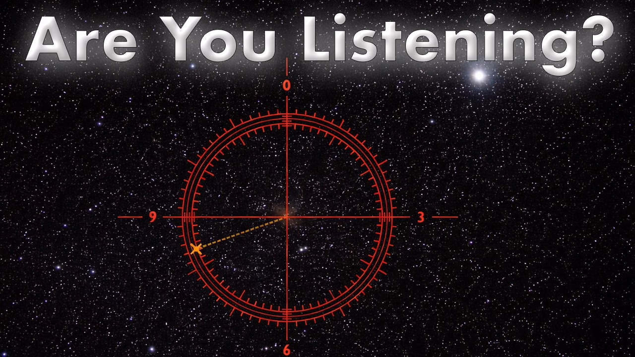
If you’re willing to listen…
Closing Thoughts
What began as curiosity became a clearer picture of how my mount actually behaves over time. More importantly, it changed how I think about diagnosing problems in complex systems. Feel still matters. Experience still matters. But measurement keeps both of them honest. If nothing else, this project reinforced one idea I’ll carry forward into every part of my imaging workflow: When something feels off, don’t guess.
Listen to what the data is already telling you.
Cheers!
Doug
Leave a Reply